SOULCYCLE
Mobile Web E-commerce
Role
Lead Product Designer (IC, End-to-End)
Responsibilities
Led the UX, UI, Interaction and Visual Design:
Helped define which features to build for lauch, including out-the-door growth opportunities.
Worked closely with and presented both high-level and detail workflows to stakeholders from Engineering, IT, Creative, and Retail.
Created E-Comm component library.
Oversaw 1 Designer for the Checkout flows and Order History page designs.
Team
Cross-Functional Team of X
2 Project Managers
1 Product Director
5 Engineers
1 Engineering Manager
2 Designers
High-Fidelity Mobile Prototype — Final layout for PDP with ‘Product Zoom’ and ‘Add to Bag’ interaction.
Add to Bag 2.0
After a successful launch in 2018 of the retail section in SoulCycle’s iOS App combined with growing business needs of the retail team, in 2019 the business decided to invest in the online web shopping experience.
The current retail experience on SoulCycle’s website did not fully support the complete functionalities of a proper e-commerce platform. As a result, we were also missing an opportunity to reach non-rider customers with our brand’s fast-growing athletic apparel lines in addition to growing brand awareness in international markets.
So, we went out and got a new super powered e-commerce platform to rebuild and design on.
Our Approach
We knew right away that we didn’t want the out of the box UX and UI design from Cloudcommerce, which while incredibly powerful was quite clunky in terms of its presentation and usability. At Soul we took incredible pride on our customer-centric experiences, and we wanted our new ecommerce experience to also reflect that.
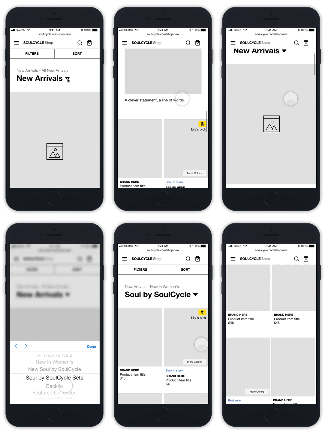
Mobile Refinement Navigation Flows — Designing filters can always be a little tricky! Here I customized several interactions via wireframe.
Wireframe & Prototype
To ensure that the experience felt frictionless and to help identify areas where we could add custom interactions and features, we created and reviewed wireframe prototyped everything. I designed the wireframes for both the general end to end shopping experience, in addition to wireframing every interaction and scenario for all our new features.
Mobile Wireframe Prototype for PLP — This interactive wireframe demonstrates the layout & category navigation interactions.
Detail Desktop View of Refinement Navigation Wireframe in Sketch — What is the max number of filters a user can apply? What happens if the labels are long?…These were some of the UI and UX scenarios to consider for the filters.
Select Color & Add to Cart Workflow — We wanted custom UI for our color options, and had to rethink the mini-cart experience to be specific for the shop.
Mobile Navigation Wireframes — For the shop mobile navigation, we had to approach how that would work in context of the Site's navigation.
I mapped out all the high-level user flows and pages of the SoulCycle shop to help the product team visual the e-commerce experience and to start mapping out the pages we would need to design.
Building the E-Comm Design Library
The current retail experience was not in sync with the current design library, which was also in the midst of getting its own overhaul, but also lacked reusable components that supported most of the new ecommerce functionalities. As part of the redesign, I designed a robust collection of e-commerce components and UI for the new set of patterns and interactions we were building.
Full disclosure, the above annotations were built in Sketch and shared on Zeplin. These days, I would defintely build these assets and their interactions out in Figma!
Streamlining two experiences.
In leading this design, one of the biggest challenges we had to consider was how were we going to approach integrating the new e-commerce platform for retail into a singular experience with the main site, which would continue to operate on its own separate platform outside of cloudcommerce. In other words several workflows would have to be revisited and designed to reflect the new technical requirements.
Shop Navigation
To meet the new technical requirements, the checkout flows for retail would have to be seperated from the way riders purchase the classes. This required us to rethink where we would display the shopping bag and how users also navigated the retail section of the site.
Search views for Mobile and Desktop
Search Flows, Shopping Cart, & Localization
With new functionalities, we had to think about how Search would be approached on the site if it was only e-commerce specific. We also had to seperate our shopping cart for retail from the classes purchases. Lastly, we needed to consider the feature of international currency, which was not to be confused for our international studio selector component.
Desktop Views — Global Header Mini Cart scenarios.
Mobile & Desktop Views — Localization experience and interaction designs specific for the retail section.
New Growth Opportunities
In addition to streamlining the two experiences between e-commerce site and the main site, we also added new e-comm consumer facing features to help grow our retail business that didn’t exist in our current feature sets.
Desktop Views — Storefront Page for Shop Section
A New Way to Merchandise
Our current web pages for retail felt like an “inventory catalog”. Without a CMS, we didn’t have any place on the primary SoulCycle Homepage to provide any context to our exclusive collaborations or our growing in-house design collections for our athletic apparel.
We decided to create a new dedicated landing page or storefront within the retail section, with its own editorial content slots to help the retail team better merchandise the products and help users navigate to the latest collections.
Add Multiple Items Directly to Bag
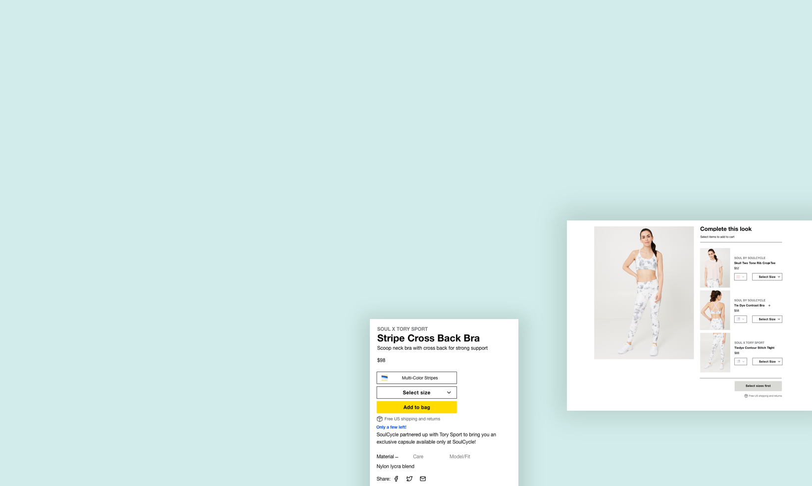
“You might also like” sections tend to suggest similar alternatives to items. This often caused customers to purchase tops not knowing that matching bottoms existed. Prior to this rebuild, there were no page layouts or components for retail merchandisers to display relevant items together with options to buy. — We added custom Product Detail Pages for Sets and also created a Complete the Look Components giving customers the ability to directly add multiple items in a single look.
Desktop View — Product Detail Page for Item Sets.
Interaction Design — Customers can directly add multiple items with in a look and view the costs before they add.
Complete the Look Components for Desktop & Mobile — In addition to PDPs dedicated to a set or look, we also created a ‘Complete the Look’ component to display on PDPs that only featured a single item.
The Designs
After many explorations and iterations. We finalized the page designs. The results consisted of new page designs with updated layouts and custom interactions to optimize the new capabilitie, features, and business requirements.
Desktop VIew —we added an inline vertical scroll to browse the different product images.
Product Detail Pages
The Product Detail Pages got an entirely new update. We overhaulted the format and layout, and added new features:
Visual design & page layout — we changed the image aspect ratios of the product photography.
We added features to improve how we displayed information such as tabs for attributes, and modal links for size guides.
We added Variant Selection Components to give user the abilities to select different color options.
Finally, we added new merchandise components to help display related items within a completed looks.
Product List Pages
We also updated the PLPs for both desktop and mobile to help better display and interact with the merchandise:
New page layout design with content slots to help add a narrative element throughout the grid of products.
Added filters, which we previously did not have.
For the desktop experience, we added a “Quick View” feature so customers could directly add items to their cart without leaving their browsing experience.
For the first time, we had cell level interactions with the products, so that users could view items in different colors, and in different views.
Desktop PLP Layouts — Updated with content slots, collection descriptions, and filters
Annotated View — Directly view and select color options on the product cells
We created badges to highlight items that were exclusive collaborations.
Account Pages, Order History, and Checkout Flows
Last, but definitely not least, we finally had the ability to support full functionality for customer accounts for retail. I oversaw the designs for many of these pages, and ultimately finalized the UX and completed the remaining scenarios before the launch.


