SOULCYCLE
Shop Retail in the App
My Role
Product Design IC for Discovery Experience
Responsibilities
Product and Interaction Design for Discovery pages: Shop Navigation and Homepage, Filters, Product List Pages and Filter, Product Detail Page, Added to Cart Interaction
Led workshops with stakeholders to get alignment. Wireframed initial end to end userflow. Worked closely with engineers and stakeholders during hand-off.
Team
Cross-functional team consisitanting of stakeholders from Product, iOS Team, Web Team, and Retail Team
2 iOS Engineers
2 Designers IC (1 for Discovery, 1 for Checkout)
1 External User Researcher
2 Product Managers
X Stakeholders from Retail Team
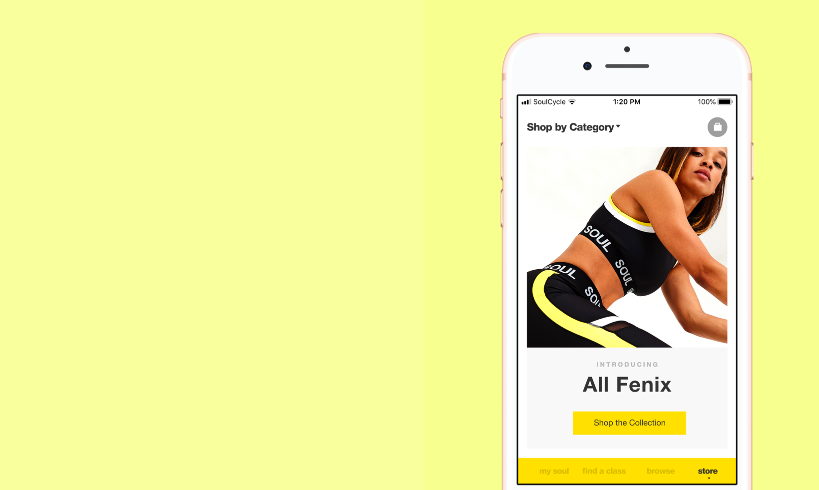
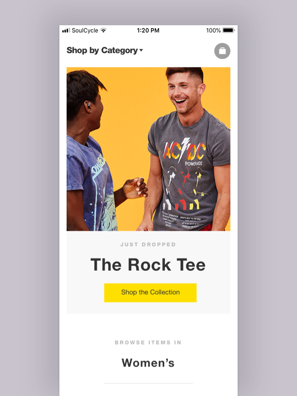
The "Storefront” view for the retail store within the SoulCycle booking app when they tap on the “Shop” tab.
80% of Users
While 80% of SoulCycle’s core users exclusively used the native iOS app for managing and booking their classes, the current e-commerce experience for shopping retail at the app was limited only to the web.
By failing to offer our most loyal riders an easy way to shop the brand'’s growing apparel collections and collaborations, we were missing a major growth opportunity for the business.
How we got there…
Design Research
Who doesn’t love a collaborative discovery phase?! I organized examples of best practices in E-Comm apps to help facilitate conversations with cross-functional stakeholders. During this process, I also hosted a workshop where we all did a “Provocation” exercise to define which features were “Must Have”, “Nice to have” and “Unnecessary”.
Persona Workshop
I also led a group brainstorm session with participants from the product, user research, and retail teams. Using goal-oriented fictional personas, the participants were asked to do some crazy-8’s and story mapping to help highlight different user scenarios for shopping retail in the app.
Wireframes, Prototypes, and Usability Testing
I wireframed the core user flows for shopping retail in the app. After a few higher fidelity iterations, I partnered with a User Researcher to help conduct Hallway Tests and User Testing sessions to test usability.
The Results
In the end, we had to be pretty ruthless in prioritizing features for our MVP, but we had a very successful launch. Ultimately, we saw a significant increase in retail purchases with over 70% of the purchases driven from the app.
A gentle animation from the bottom tab reminding users they left items in their bag.
Navigation & Dashboard
What does the user flow look like in the app without disrupting the current workflow for managing classes? And how do we display the information related to the retail shop experience on the main landing page of the app? These questions served as the foundations for how we approached our solutions for the rider dashboard that our users were so accustomed to coming to.
First we added a new store navigation tab to serve as the home for all things retail. We also made a custom notification that launched from the bottom tab to display messages related to new retail collections and items left in the shopping cart.
Custom animated notifications to promote new collections.
Added a Storefront Page
Our current web experience for shopping retail didn’t have a Storefront view, but after several workshops we decided that we wanted to introduce a landing page to offer some editorial space and a way to navigate the retail section of the app.
Selected views of the Product List Page with different scenarios for the New Arrivals Category and the Brandshop Category.
Views of the Product Detail Page interactions with custom designs for app.


